In November 2009 I noticed a pattern—the S&P 500 index was tracing out a pattern uncannily similar to the S&P chart exactly six years previous. In the four years from April 2009 through April 2013, the average difference between the S&P 500’s closing value for the same day 6 years previous was 3% and the yearend values were within 1.6%. Using this correlation I predicted 1418.30 as the S&P 500 December 31st,2012 close—which was 0.56% away from the actual close.
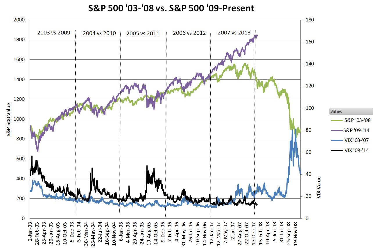
In 2013 the correlation failed, with the S&P 500 closing 25% higher than the 2007 close of 1468.36. My 2013 prediction was way off, and I’m relieved.
I believe one of the most pervasive conceptual errors we make is mistaking correlation for causation.
Consider the chart below where I have intentionally mislabeled the right vertical axes. The left axis is labeled “Individuals Diagnosed with Autism”, and the right axis is labeled “Pesticide Sales $M”.
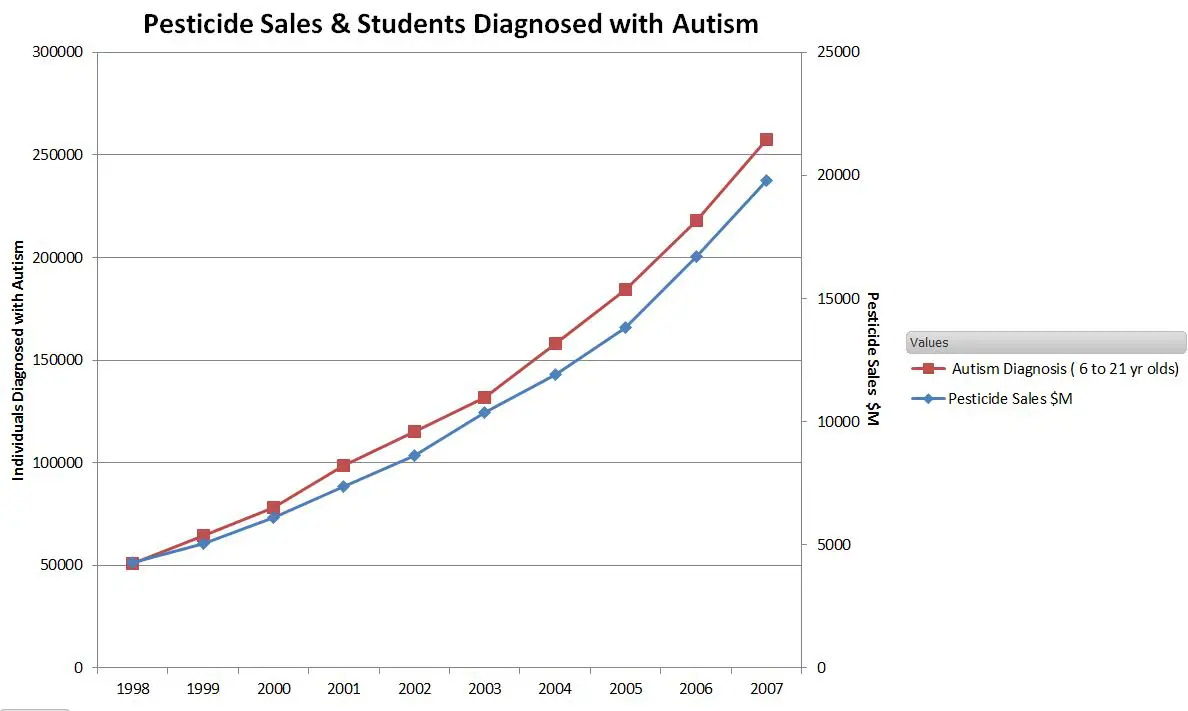
Based on this chart would you likely accept that pesticides were at least one of the causes of autism?
Now, plotting the real-life data with the right axis correctly labeled as “Organic Food Sales $M”.
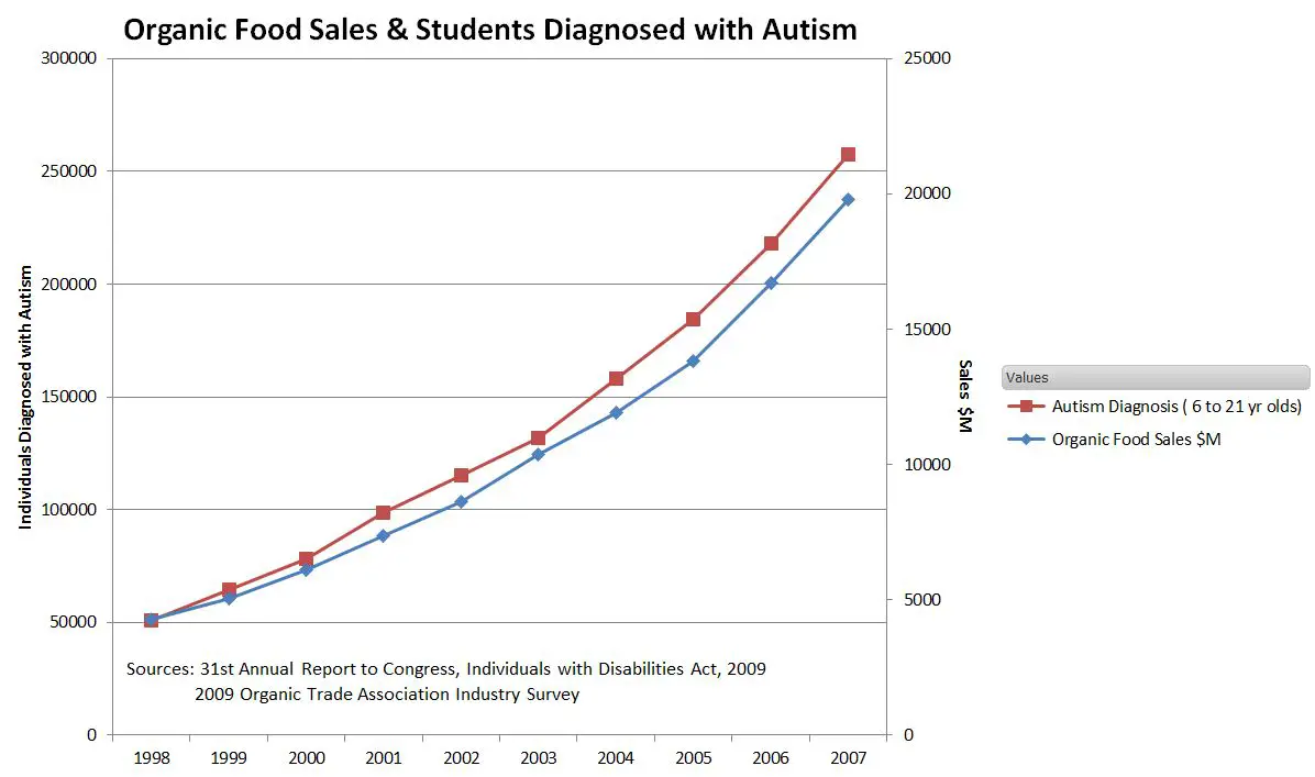
2009 Disability Act Report, 2009 Organic Trade Association Survey
Are you ready to accept that organic food is a cause of autism?
Remember the noise you had in your head when you looked at the organic food vs autism chart. You should get that more often.
Obviously, our beliefs influence our willingness to accept patterns as evidence of causation—but the natural bias is to accept correlation as causation. In our everyday lives, it’s a reasonable assumption and part of our culture (e.g., “Where there’s smoke, there’s fire.”). If we wake up to a bang in our house we don’t assume a picture fell off a wall—we believe something or someone is bumping into things.
With computers and the internet, our natural interest in patterns is intensely facilitated and amplified. Greed is fully engaged too—if we can identify a pattern that enables us to predict the future we can become rich!
So how can we discern between patterns that denote causation and those that don’t?
First of all, we must embrace randomness. Our intuition wants to ascribe causation to correlation, but sometimes patterns just randomly align. If both headlights in my car fail within a few minutes it’s likely there’s a shared cause (e.g., excessive voltage), but it’s possible they both just wore out. Physicists are fond of saying, “Everything that can happen does happen.”
Second, we need to recognize that we look at a lot of patterns and often subconsciously reject those that don’t correlate. The ones that correlate seem to jump out at us. The more patterns we look at, the more likely we are to discover matches that are just coincidences. I don’t know who originally found the autism vs organic food correlation. I first saw it here, but it suggests that people and computers are comparing a lot of data sets.
Third, develop a model. It’s not enough to just look at the data. If we think there’s causation present, then we should be able to use the scientific method to construct a hypothesis of why A causes B. Once you have a hypothesis look for ways to test it. Can it be falsified? See Popper for more on this. Have the intellectual courage to not just look for ways to prove your creation, but look for ways to invalidate it too
Fourth, make predictions with explicit timeframes and test the results. Did that “head and shoulders” pattern play out the way you predicted? If you believe the Fed’s QE3 is fated to create hyperinflation when/where do you think that inflation will emerge?
I’m not suggesting that everything can or should be reduced to equations. Still, we should at least construct a story, make predictions that we’re willing to test and if those predictions fail admit we’ve probably been duped by the correlation fairy.
Thanks for this great post. We data junkies always want to attribute data and indicators with magical predictive powers when in reality the indicator may just be reflecting some simple math equations calculating the trend.
It was interesting while it lasted. I didn’t put much stock in it from predictive perspective. I guess history only ever rhymes.