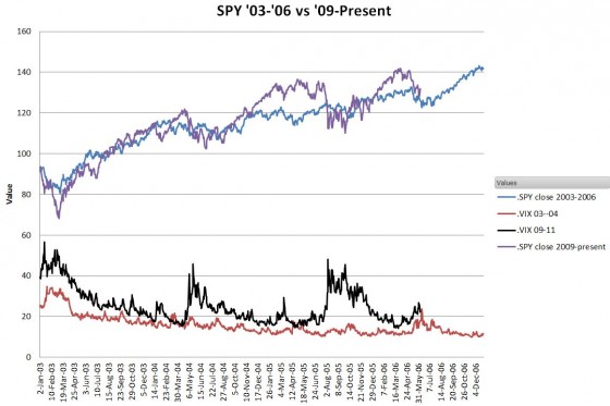
The market recoveries from the Tech Crash and the Financial Crash were remarkably similar. As I blogged in February 2012, the S&P 500 index closed out the 2009 to 2012 period within 4 percent of the index 6 years before.

The 2012 year market, just like 2011, started out fast but the spring correction brought it back to the old path. In June 2012 SPY closed within 1 percent of its value exactly 6 years ago.
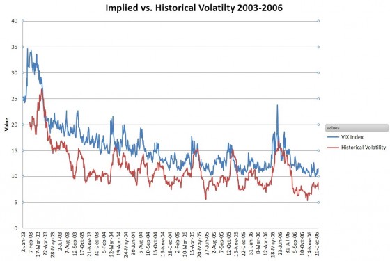
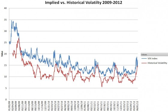
Volatility was the big difference between these two markets. The annualized implied volatility has averaged over 75% higher than the 2003—2006 levels (IV 22.62 vs. 12.76). I wondered if the realized / historical volatilities differed by that much. The charts below show those relationships for the 2003 – 2006 and 2009 – 2012 timeframes.


You can see the typical implied (IV) vs. historical (HV) volatility relationship—The HV briefly spikes higher than the IV in the late stages of a correction, and then the HV drops, mean reverting much faster than the IV. Around then everyone complains about how high the IV is compared to the HV value… Looking at the average values, both the implied and historical volatilities show the same 75% increase over the market 6 years ago (HV 17.68 vs. 9.96).

Click here to leave a comment